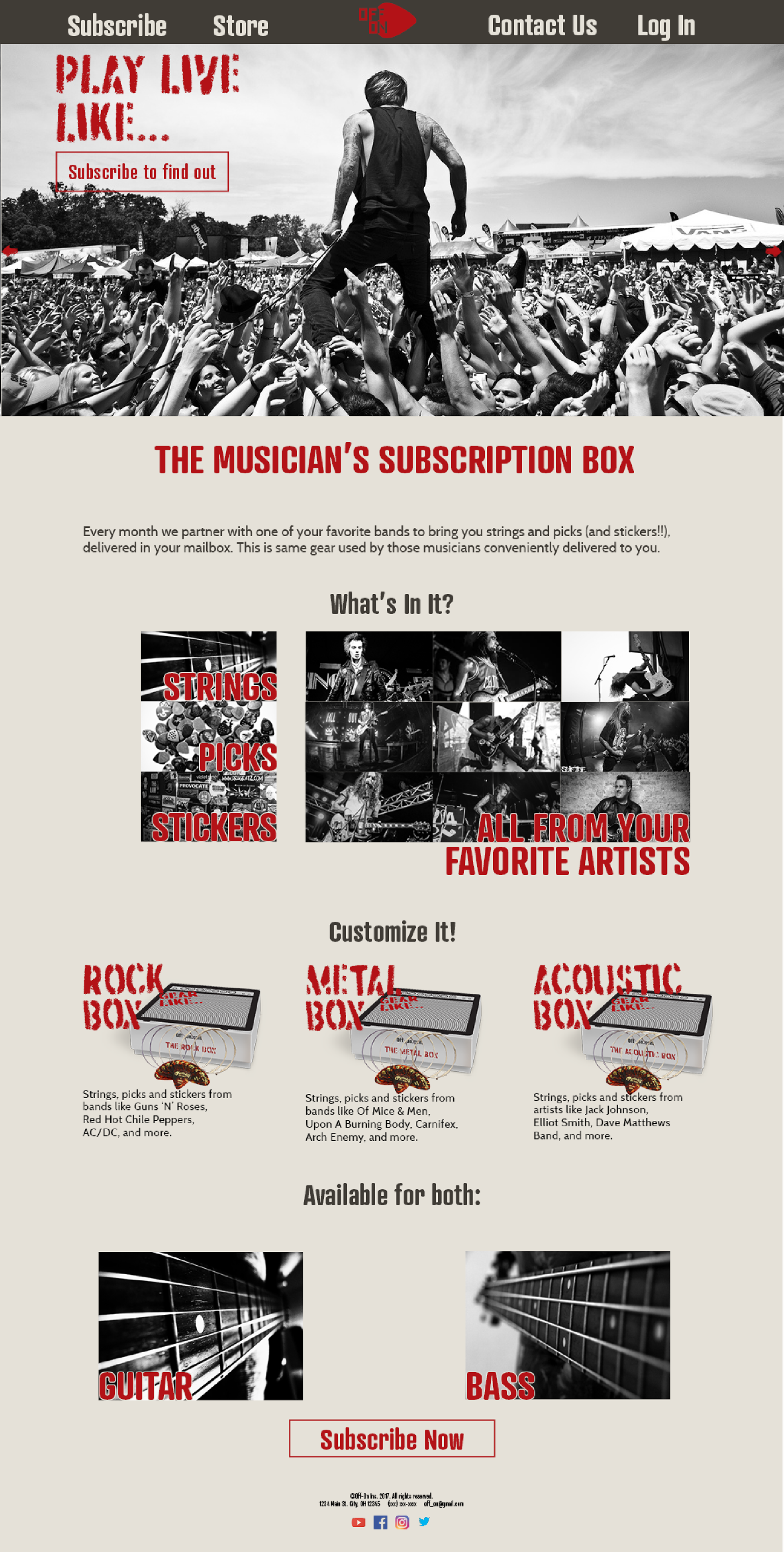
As a student at Cleveland State, I was tasked with creating and developing a visual identity for a new online niche retailer.
The brand I designed is called Off/On. It is a subscription service for guitarists and bassists the delivers gear used by their favorite artists every month.


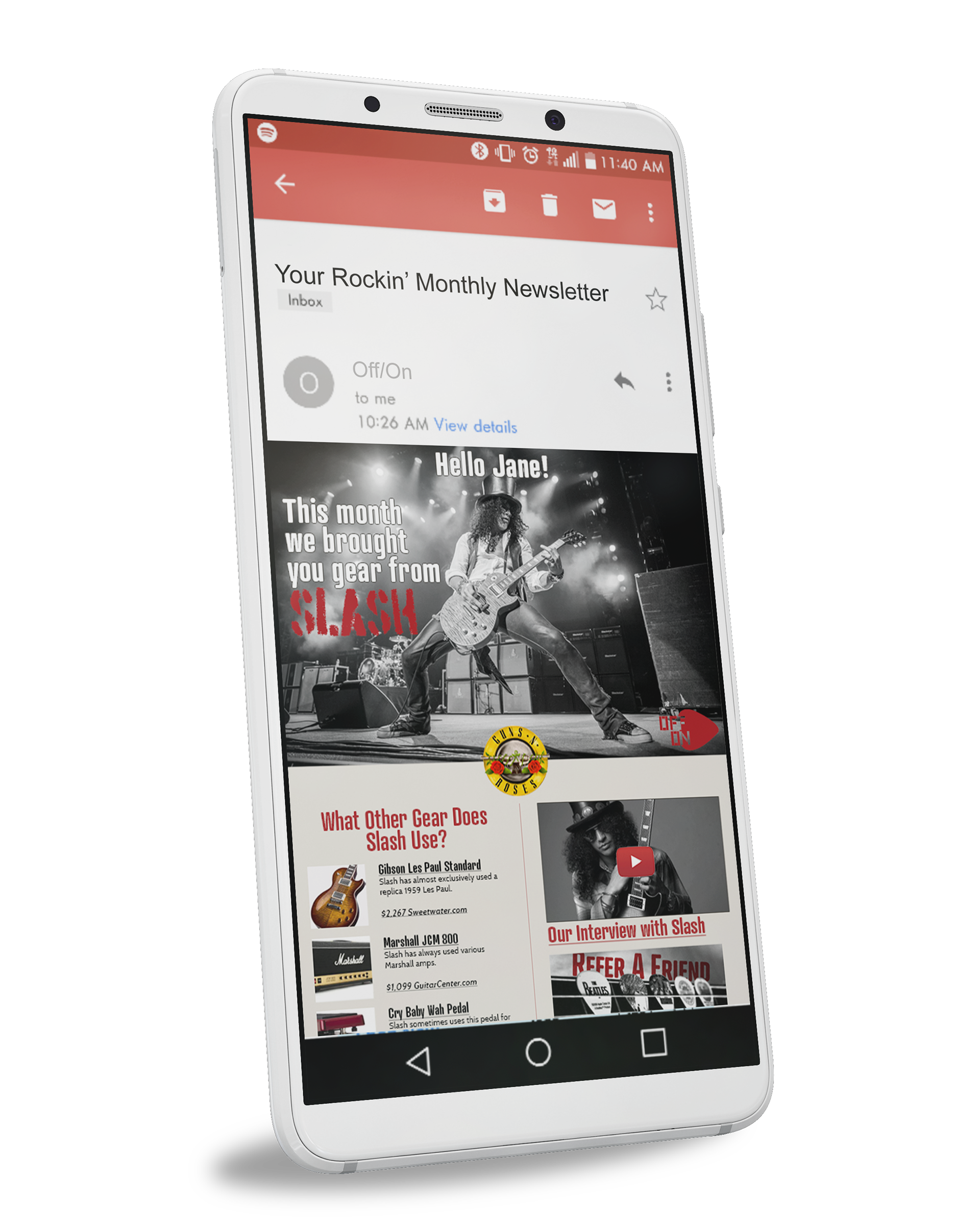
How do we get people to open the email?
How do we get them to click on the links?
To achieve this, the newsletter would tie in to the theme of that months box. The User would receive the box at the beginning of the month, then 2 weeks later they would receive the newsletter with additional gear and interviews to build on the gear they received earlier.


I also put together a short promotional video for the service. The purpose of this video is to explain the service that is being provided.
Video is a powerful medium. However, people have a short attention span and a lot of people watch video without sound.
For these reasons, I made the video short (20 seconds), and used kinetic text rather than relying on audio.

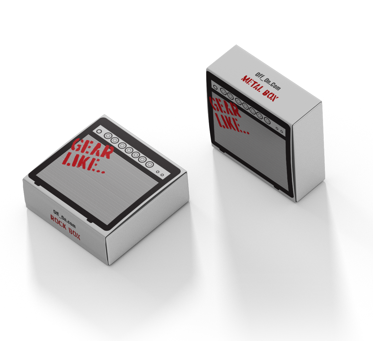
Unboxing the product should be exciting as the audience discovers who the band for that month is. Using the tag line "Gear like..." is designed build suspense as the person goes to open it.
Additionally, I wanted to highlight the different genre boxes, making it more personal and highlighting the diversity of the service.
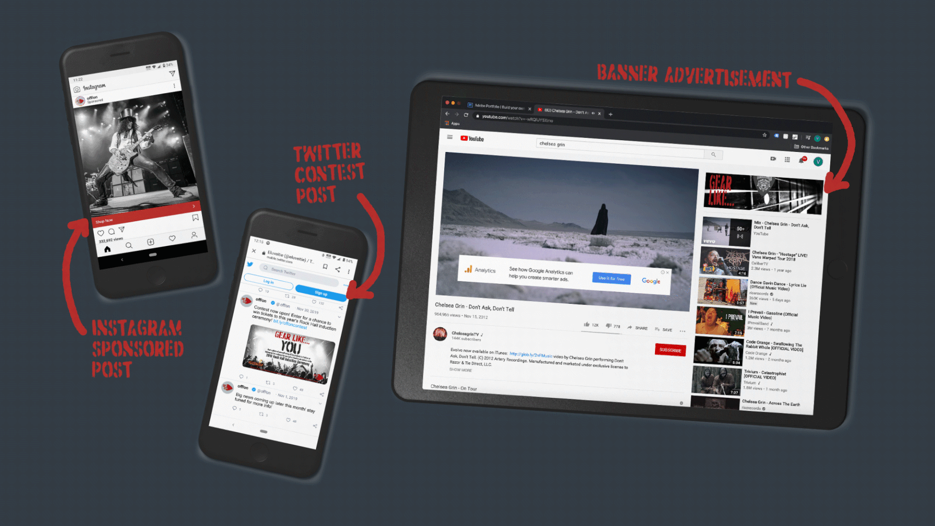
The packaging is also an opportunity to expose people in the public to the service. For example, seeing the packaging in the mailroom of an apartment complex, would expose others to the service and perhaps make them curious about it.